|
|
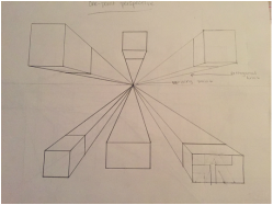
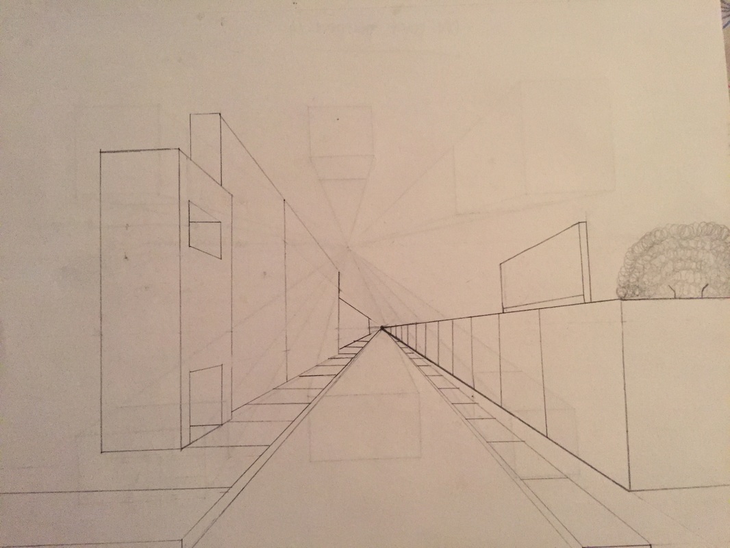
These are drawings I did in class to learn about one-point perspective. The first is just boxes to practice. The second is a street scene.
|
|
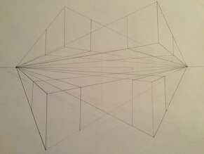
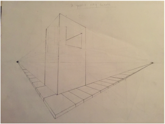
These drawings are done in two-point perspective. The one on the left again is practice; the one on the right is another street scene.
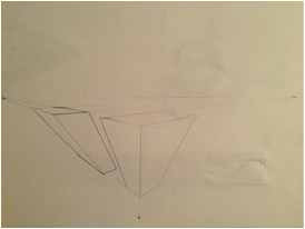
This is three-point perspective practice I did in class.
|
|
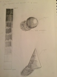
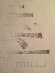
This is a value chart and Value shapes in pencil. It taught me how to control my pressure on my pencil.
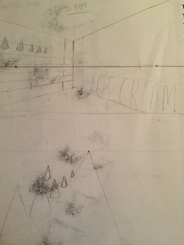
These are the sketches for a value form repeating sketchbook project. I had the idea for an ice cream shoppe, a forest of Christmas trees.
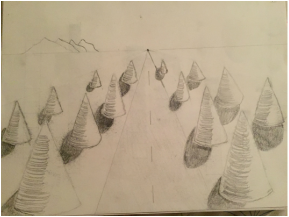
This is my repeating value form sketchbook project. I decided to draw the forest of Christmas trees.
This is a value chart in pen and ink. this was taught to help us to control lines and pressure on the paper.
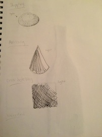
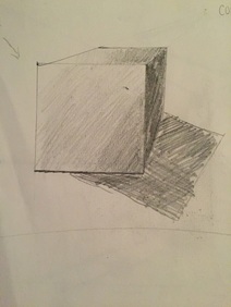
For my form studies in pen and ink I did a sphere in stippling, a cone in hatching, and a cube in cross-hatching.
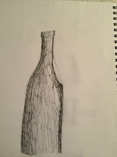
A wine bottle drawing to practice pen and ink techniques and shading.
|
|
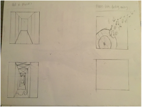
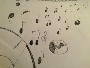
These are my idea sketches and final sketch for my project I had the idea for a hall of mirrors or a broken record with music notes floating away. I chose the broken record because music is something that means a lot to me and I also thought it looked cool.
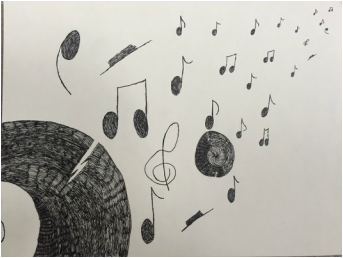
1) I decided to use hatching in my project. I decided to use hatching because when I was practicing I thought that hatching looked the best. I decided to only use one technique because I wanted it to be simple. I tried the other techniques and I chose this one because I thought it looked the best.
2) I used perspective to make my drawing look like it was going off into the distance. I started off with my music notes big and made them smaller as I went. Perspective is important because with out it everything would look flat and out of proportion. With out perspective some of the best works of art would not be created.
3) Texture is important in compositions because with texture you can display what it looks like and what you wold feel if you actually touched it.
4) Value is important in this piece because if this piece didn't have value the records would just look like blobs. The value in this drawing creates the appearance of the records.
5) My craftsmanship isn't very good drawing it not my best topic. I thick my craftsmanship would be better if I could draw better. I also think that if I had made my lines neater then it would have been better.
6) If could recreate my piece then I would leave the inside of the second record blank like the first and i would also be more careful with my lines.
8)When using pen and ink techniques its important to understand the techniques so you can use them right in your art. It is also important because you want the piece to look like an actual object.
9)I think that what I have learned my help me slow down and control my lines. it will help me in future pieces to be more patient and slow down.
|
|
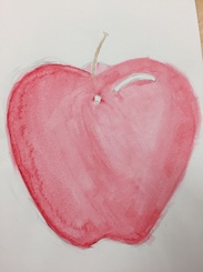
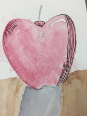
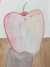
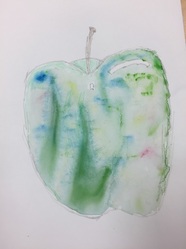
These are my four watercolour apples. In class we painted them to practice watercolor techniques. On two of the apples we added pen and colour pencil.
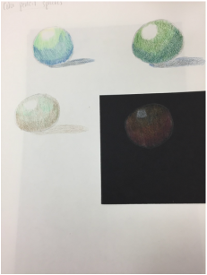
These are my colour pencil spheres. The first one is hatching and cross-hatching. The second is layering. The Third one is base colouring. These helped me practice blending. I liked the hatching and cross-hatching.
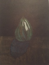
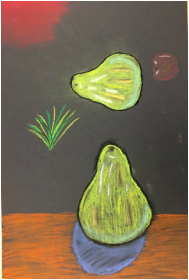
This pear was practice using coloured pencils. Practice using colours we might not see in real life. i helped my learn to blend colours and to learn balance between colours.
This was our practice with oil pastels. Oil pastels are by far my favorite media to work with. Even though they were messy. I think oil pastels are easiest to work with.
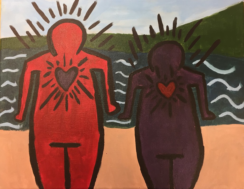
1) My referanced artist for this project was Keith Haring. The four main ideas I use from my research were: colour, simplicity, meaning, and precision.
2) I belive the craftmenship is fairly well and mostly neat. I belive I couldv'e made my lines neater.
3) The hardest part of the project was figuring out how to make the background simplistic to fit in with Keith Haring's style. It was hard to figure in the background as the style is simple and the picture of the background is detailed.
4) I chose these colours because while still being a solid bright colour it still sybolises meaning.
5) The style of my landscape reflects my chosen artist because it's simple and flat and although it is my picture i broke it down so that it is simplistic and fits with the simple style.
6) I would like to say that if Keith Haring saw my painting today he would like it.
7) If I could do this project again I wouldn't because I love the way it turned out but if I did have the chance to go back and change something I would be neater and more careful with my lines.
|
|
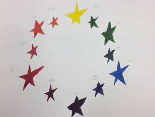
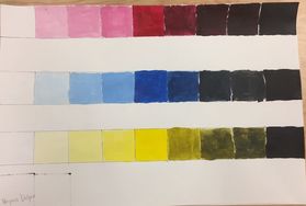
These are a colour wheel and a value chart we created to get a feel for colours and values. I decided to use stars on my colour wheel.
|
|
|
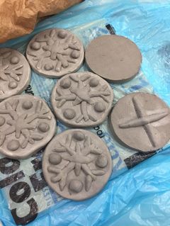
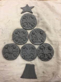
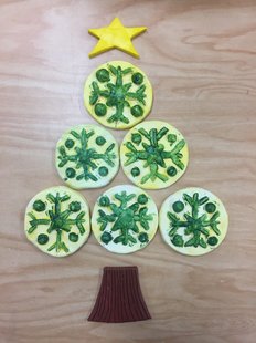
1.) The craftsmanship in my opinion is not the best and could be better. I believe it could be a little bit neater.
2.) The most difficult part of this project was actually sculpting the sugar cookies. 3.) I believe that all the colours work harmoniously together to create the look of a Christmas tree. 4.)No not particularly because it is in fact flat. It really only looks good from the top because that is the only angle you can really see anything from is the top. |
|
5.) The difference in sculpting or drawing and painting something is that it takes much more conscious effort to sculpt something because you really have to pay attention to what your doing.
6.) I made dents and little scrapes in the clay to represent the texture of a cookie.
7.) It kind of looks like the real food but it could look a little more realistic.
6.) I made dents and little scrapes in the clay to represent the texture of a cookie.
7.) It kind of looks like the real food but it could look a little more realistic.
|
|
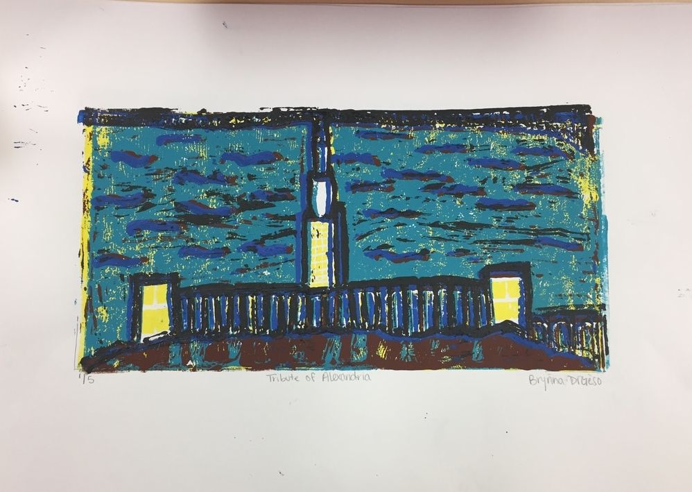
1.) I believe the print is within the registration marks and the carving is well done. I also believe the burnishing and coverage could've been better.
2.) For the texture I used line to make it look like there was texture. I love the colours I used i think it could have been a little neater. I think i could have balanced it better and made neater and more in line.
3.) If I could recreate my pieces i would definitely try to make them line up better and neater.
